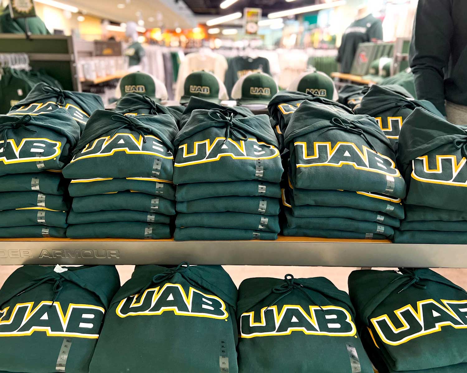
Our refreshed identity features a shared primary logo that is used across the University, Medicine and Athletics—a first in our history. This alignment reflects our shared mission to enrich society and improve health and well-being through transformational educational experiences, groundbreaking research, innovation and entrepreneurship, community engagement, and world-class patient care.
One notable change is that the UAB Medicine brand will now encompass all aspects of our academic medical center, including the UAB Heersink School of Medicine and its departments, centers, institutes, and programs. This strong connection between the Heersink School of Medicine and UAB Medicine clinical enterprise unifies our work, streamlines our message, and strengthens our voice and our impact on those we serve. Across the institution, our brand stands for excellence: nationally ranked academics, competitive athletics, and a premier academic medical center.
How to Use This Site
You’ll find all the brand guidance you need here, including logos, colors, and typography, for all three entities: university, medicine, and athletics. You can find additional marketing and communications guidance—and submission forms for publicity, marketing approval, web edits, and more—on the Office of Marketing and Communications website.
To request approval on your promotional projects and to hire a freelancer or contractor, please use the Marketing Approval Form. To order UAB-branded swag for your unit, follow the steps on the Order Branded Items page.
Marketing ApprovalOpens an external link.Order Branded Items


Be a Brand Ambassador
As a part of the UAB community, you have a critical part to play in advancing our brand. Your experiences as a student, alumnus, employee, patient, donor, athletics booster, and supporter shapes UAB’s identity across the state and nation in authentic and meaningful ways. We encourage you to be a brand ambassador and let your unique UAB story contribute to how others will understand UAB’s culture and mission.
A Bold Vision
As UAB continues its transformative growth, we are newly aligned around a refreshed visual identity that reflects our values, mission, and institutional pride. We embrace our future with a unified brand that for the first time in our history will be used across the University, Medicine, and Athletics.
Additional Resources
Office of Marketing and Communications Opens an external link.
Find request forms, guidance, and other support for your projects.
Request Publicity Opens an external link.
Submit your item for internal or external coverage.
Salesforce Opens an external link.
Explore how these digital tools can help you effectively communicate with your audiences.


